Tag Archive for "iPhone"
While I’m pretty sure no one cares, here’s a new list of my gripes with the iPhone. I did one of these in 2011 when I switched from the iPhone 3GS to the Samsung Galaxy S2 (still one of my favourite phones).
Since then I’ve been through a couple more Samsung Galaxies (S3 and S4) before switching camps and trying out a Microsoft Lumia 640 running Windows Mobile 8.1 followed by Windows 10.
I was very surprised by how much I liked using Windows Phone and in particular I thought the “launcher” (i.e. the home screen, app drawer and icons/widgets) was significantly better than the Android and iOS equivalents. I liked it so much that I was seriously considering buying the new flagship Lumia 950 but then I got a new job which came with a company supplied iPhone 6S+.
While the iPhone 6S+ wasn’t quite what I’d have chosen for myself, I was still pretty pleased to get the top of the line model of one of the best smartphones on the market and I was curious to see how the iPhone and iOS had developed in the last 5 years. What I didn’t expect was that it would be so damn annoying. In no particular order:
- Apps seem to freeze or crash more than I’m used to, particularly when they’re trying and failing to update their data (e.g. Twitter and Scrabble).
- The built-in keyboard still doesn’t support swiping. “Hey”, you say, “iOS supports third party keyboards now!”. Unfortunately it doesn’t support them very well, with some parts (like search) still using the built-in keyboard, and other applications seeming to randomly switch between them. Adding insult to injury, Microsoft has released their excellent Flow keyboard for iOS – but not in New Zealand. (Update: Google Gboard keyboard is pretty good.)
- The iPhone 6S+ has bad physical design. It’s far too slippery. The rounded edges make it hard to pick up from a flat surface. The buttons still have unpleasant sharp edges. The camera is off-centre which means that it jiggles when you try to use it on a desk. It’s the first phone I’ve ever felt obliged to get a case for to overcome the flaws in the physical design (I note that the Apple leather case is very nice and helps with a number of these gripes).
- Related to this is that it’s surprisingly heavy, both in absolute terms and when you compare it to other phones with similar sized screens from other vendors. Compare the iPhone 6S+ with a 5.5″ screen at 192g to the Lumia 950XL with a 5.7″ screen at 165g or the Samsung Galaxy S7 Edge with 5.5″ at 157g. I really notice the extra weight when reading in bed, and it makes me wish I’d got the iPhone 6S instead.
- I haven’t been impressed by the battery life which, in such a heavy phone, should be pretty awesome. I think it’s worse than my last couple of phones but that’s pretty subjective. Annoyingly you can’t carry a spare battery and just swap it in (a feature becoming less popular in Android and Windows phones too). There’s also still no wireless charging.
- At NZ$1599 for an iPhone 6S+ with 64GB, damn it’s expensive.
- The use of a proprietary Lightning connector for charging means that it uses a different connector from pretty well every other device we own that all use micro-USB (camera, tablet, UE Boom speaker, Kim’s phone, etc). It got even worse when Kim upgraded to a Nexus 5X with USB-C – suddenly we had three connectors to support. On the other hand, at least USB-C seems likely to be the standard of the future, the Lightning connector is always going to be an orphan for which the cables cost significantly more than the other options.
- As mentioned earlier, the camera is in the wrong location right up in one corner. Yes folks, it’s the return of the “finger in shot” screw-ups. How come the rest of the industry has worked out that cameras belong in the middle but Apple still seems unaware?
- The home-screen/launcher feels like it’s hardly developed since my iPhone 3GS. Yep, it’s still just a bunch of icons. There’s still no widgets or live tiles for quick display of relevant information. The design guidelines seem to encourage making icons look as like each other as possible. You can’t even arrange them spatially except between pages – gaps aren’t allowed and they always autofill the available space. As for multi-page folders, I have no idea what they were thinking with that one.
- The Settings app is big and sprawly and really needs a good rethink. I scrolled through five screen pages worth of top level setting items and it’s just too much.
- Apple – I don’t care whether you rip off the notifications and quick settings design from Microsoft or Google, just choose one and get copying. Special mention: it seems very odd that I can’t force-touch or long-press the bluetooth and wifi icons in the settings slide-up to get to the settings for those functions.
- I really miss the back button. Every app does it its own way and sometimes they have both “back to the calling app” and “back within this app” – naturally I always get the wrong one. Even worse some apps seem to have no back at all so once you’ve acitvated them from another, the only way to get back is to use the task switcher. I’m prepared to admit that the back button on Android and Windows Phone isn’t always perfect but I’d rather have an imperfect one than none at all.
- There’s even more use of popup hidden UI elements than since the last time I griped about it in 2010. E.g. in Safari you don’t get any controls unless you jiggle the page the right way. Many apps are implementing swiping left or right to reveal hidden UI elements, but they’re both hard to discover and inconsistent between apps.
- I assumed that with Apple having such a large market share and only one supported browser that everyone would ensure their mobile web pages worked in Safari. Apparently not.
- I wish I could work out the magic that would let the iPhone consistently reconnect to my phone headset whenever it’s in range.
- Bluetooth control options aren’t very flexible. You can’t tell the iPhone that you want to use a bluetooth UE Boom 2 speaker for music but not for phone calls or notification sounds.
- The Search often seems to freeze up for 5-15 seconds between entering search terms and the “Search the Web” button being displayed. It’s very odd.
- When the iPhone screen is off there’s no way to tell if there’s any messages or other important notifications waiting for you. There’s no notification light, nor a Windows Phone style low-power always-on Glance screen with time/date/notifications.
- I have tried more than once to use Siri and we just don’t understand each other. Come back Cortana!
- The screen rotation settings don’t seem quite right. Sometimes it triggers too easily, sometimes not easily enough. I miss the hack I had on one of my Android phones where I could enable screen rotation for some apps (e.g. video and photos) but not others.
- Internet connection sharing works well – but apparently it’s such a critically important function that Apple has to add a blinking bar at the top to constantly warn you that you have it enabled. Even worse, this bar doubles the height of the top bar so that some applications don’t quite display properly.
- The multi-tasking is pretty shocking. You can’t keep a network client connected (e.g. IRC), apps have to be left active to download data (e.g. offline maps and music), many apps are very slow at updating their notification badges, and apps don’t keep in sync with their notifications (i.e. the badge shows there is a message but when you go into the app it shows no new messages until it refreshes).
- You can’t replace standard apps with others if you prefer Google Maps to Apple Maps, or Chrome to Safari. Indeed, there’s a general feeling that Apple applications and services are first class citizens and Apple wants to make everyone else’s stuff just run that little bit worse.
(Yes, this article is just an attempt to get everyone to tell me ways to fix all my gripes and thereby improve my iPhone experience.)
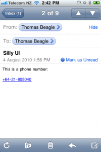
I really like the way that the iPhone recognises phone numbers in emails and turns them into touchable links.
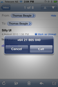
But for ages I thought that all you could do was call the number.
This used to really annoy me because, being a modern kind of person, I generally prefer to text people than call them. Other times I just wanted the number to add to my address book, so I’d end up cutting and pasting the number into Contacts.
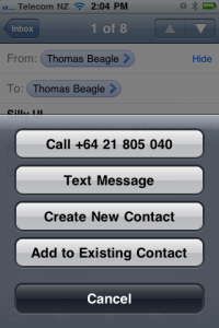
Then one day I lingered on the link too long and a whole new menu popped up! Hey, here were exactly the features I was looking for.
Now, there are two problems here.
Firstly, there is no advantage to the user from this arrangement. In both cases the phone displays a menu with one or more actions and an option to cancel it. The required user actions are the same:
- Press (or press and hold)
- Press selected option or cancel
If the user interaction is exactly the same why not just show the full menu in both cases?
Secondly, and more importantly, this “press and hold” functionality is hidden from the user and there’s no way to easily discover it. I’d had my phone for a couple of years before I realised it was there (I’m assuming it wasn’t added in an OS upgrade) and I wonder how many people still don’t know about it. And what other convenient features am I missing just because I haven’t thought to check that they might be there?
To my mind, “press and hold” is a user-unfriendly way to add functionality and should be avoided wherever possible.


